
Stonebrook Day School has been doing something genuinely special in Murfreesboro for over two decades. A three-acre natural learning campus, a Reggio Emilia-inspired philosophy, small class sizes, and educators who treat every child as a capable, curious individual. For parents who find them, it's an easy decision.
The website, though, was making that decision harder than it needed to be.
The old site was a product of a different era of web design, and it showed. Outdated visually, built around SEO tactics that search engines had long since moved past, and structured around sharing every piece of information the school had rather than guiding a parent toward the one action that actually mattered: scheduling a tour.
Navigation was deep and branching. Individual pages existed for topics that could have been handled in a paragraph on a broader page. The copy was dense with keywords written for search engines rather than for a parent sitting at their kitchen table at 9pm, trying to figure out where their child should spend the next five years of their life.
Stonebrook had a compelling story. The site was too busy telling it in every direction at once to actually tell it well.

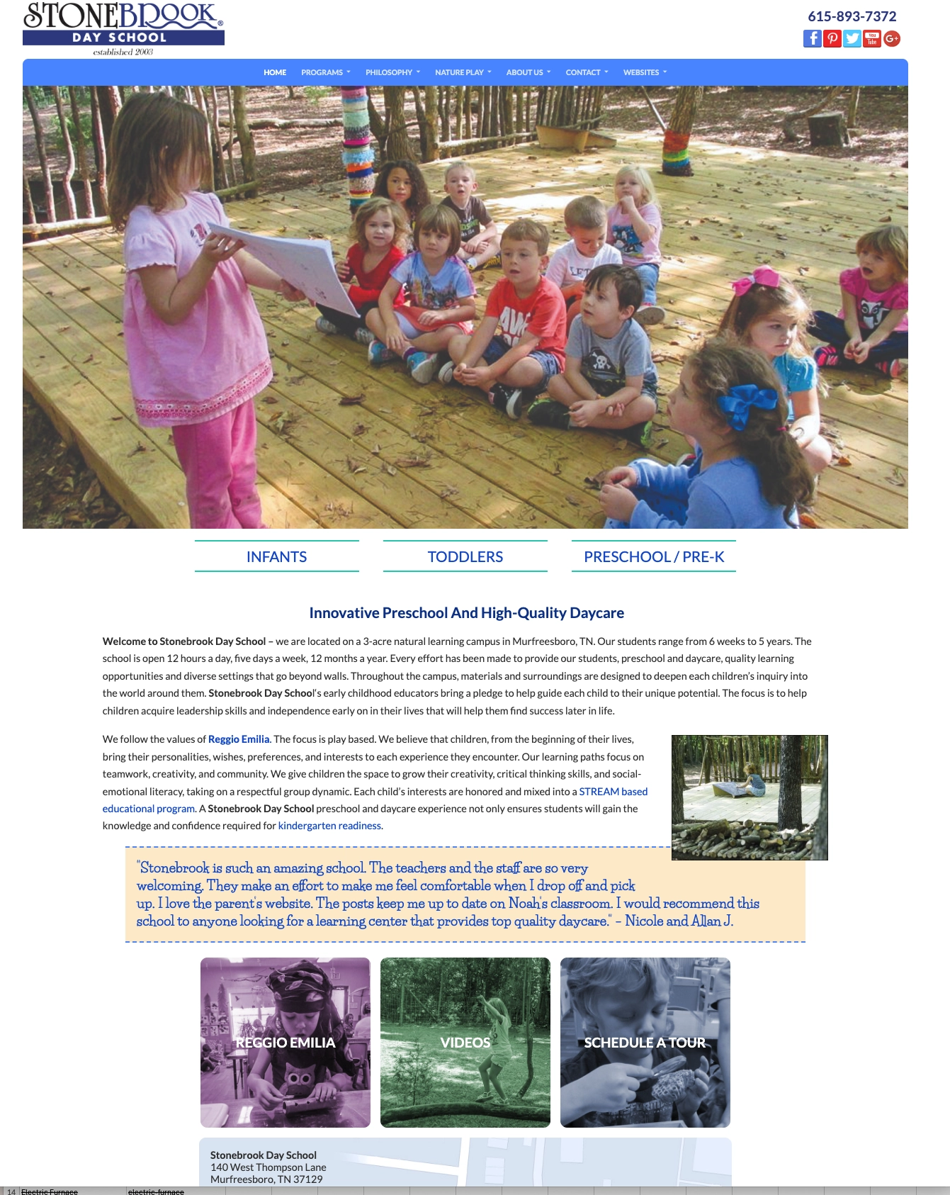
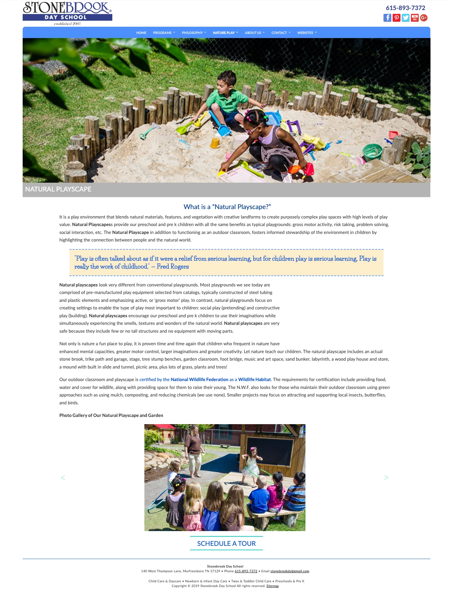
When we worked through the strategy for this project, one thing became obvious quickly: a parent researching a daycare or preschool does not enroll online. They tour. Every decision that follows, whether to apply, whether to put down a deposit, whether to tell other parents about the school, flows from that single in-person visit.
That meant the website had one job. Not to answer every possible question. Not to document every aspect of the curriculum. Not to prove the school's philosophy through exhaustive explanation. Its job was to earn enough trust to get a parent to book a tour.
The old site was trying to do everything, which meant it was doing the one important thing poorly. Every additional page, every deep navigation item, every dense block of text was another opportunity for a parent to get lost, get overwhelmed, or simply close the tab and move on.
We also identified the distinct audiences a preschool and daycare draws. Parents of newborns and infants have a very different set of fears and questions than parents of preschoolers approaching kindergarten. Both needed to feel seen by the site before they would trust it enough to act.
The restructure was the most important decision of the entire project. We reduced the overall page count significantly, consolidating information that had been spread across dozens of individual pages into well-designed overviews that gave parents what they needed without overwhelming them.
In place of the sprawling page architecture, we built dedicated landing pages for each age group: infants, toddlers, and preschool through Pre-K. Each one speaks directly to the parent of a child that age, addressing their specific questions and concerns in language that feels like a conversation rather than a curriculum document. A parent of a six-week-old has different fears than a parent of a four-year-old. The site now acknowledges that.
The conversion goal, booking a tour, is present at every stage of the experience. It is not buried at the bottom of a contact page. It is woven naturally throughout the site so that whenever a parent reaches the moment of readiness, whatever page they are on, the next step is immediately clear.
The visual redesign modernized the school's presentation without removing its warmth. The natural campus photography, the children at play, the outdoor classrooms and the Playscape, all of it that made Stonebrook feel different from a standard daycare was brought forward rather than buried under text. A parent should be able to feel what makes this place different before they read a word of copy about it.
Old SEO tactics that were actively working against the site's credibility and performance were removed entirely in favor of a clean, modern approach built around clear content, fast load times, and local search best practices that actually reflect how search engines work today.
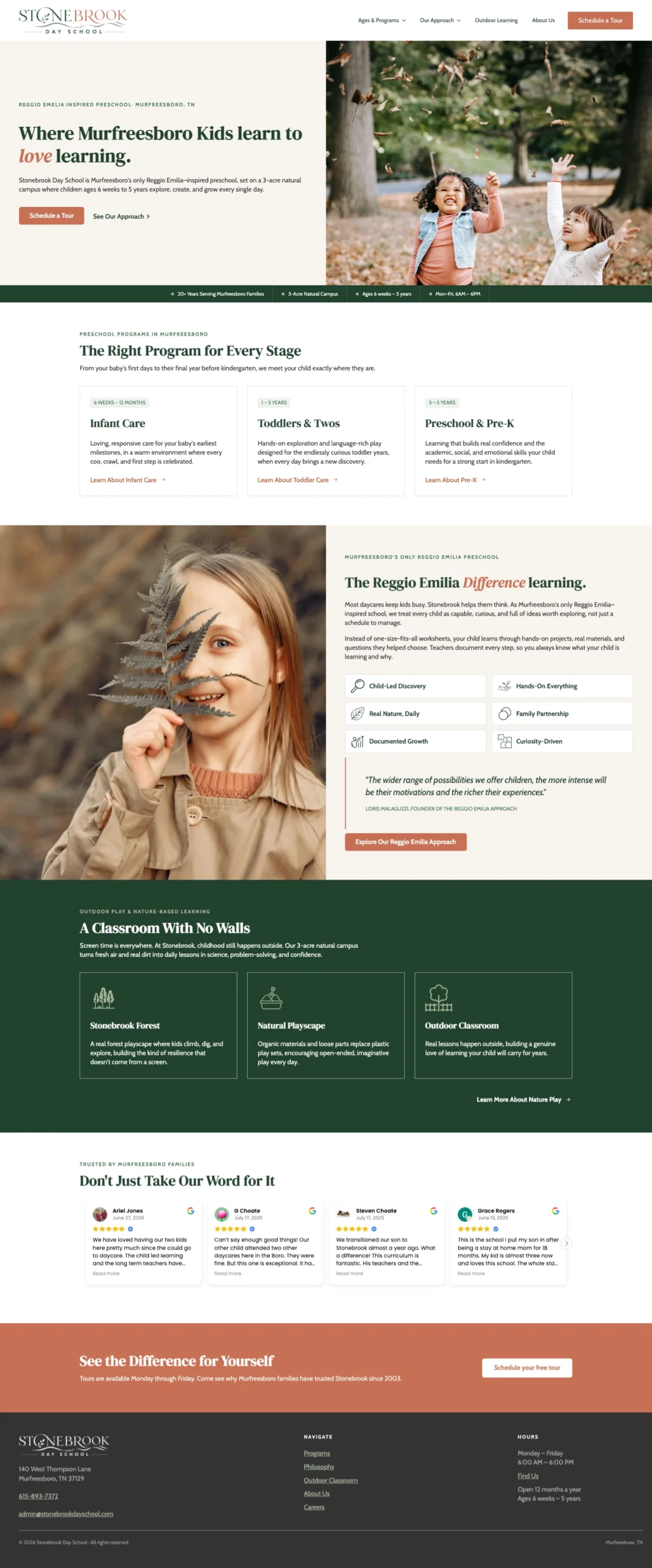
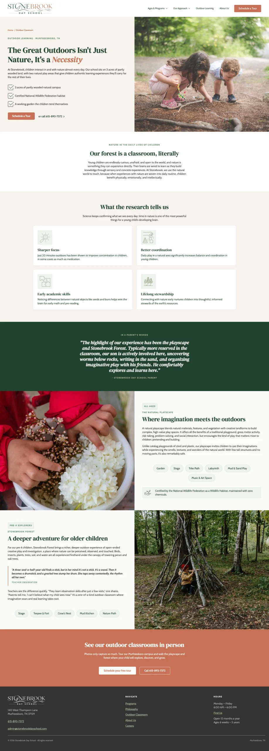
The instinct for any organization with something real to offer is to share all of it. Every program detail, every philosophy page, every credential, certification, and award. It comes from pride in the work, which is understandable. But for a parent who is time-poor, emotionally invested, and overwhelmed by the decision, more information is not always more helpful.
The Stonebrook redesign is a lesson in restraint. The school did not become less impressive by saying less. It became easier to trust, because the site stopped asking parents to do the work of finding the signal in the noise and started doing that work for them.
When you know what you want a visitor to do, every decision about what to include, what to cut, and how to structure the experience becomes easier. Stonebrook wanted parents to book a tour. Everything else on the site either supported that goal or got in the way of it.
We kept the former and removed the latter.